Posts

Showing posts from 2016

Sketchbook #9: Only Black Things:

Image

Jay Maisel Inspired Final:

Image
Here is the final  image, raw and unedited: Taken on Olvera Street Here are my other images- not as colorful as Maisel's work, yet inspired by him. Taken on Hollywood Blvd. Taken on Olvera Street Taken on Olvera Street Taken on Olvera Street

Sketchbook #8: Recreate the Rest of the Scene:

Image

Assignment #12: Little Planets:

Image

Edited Photos {12.05.16}

Image
Hitchcock

Assignment #11: Yo, Paparazzi!:

Image
Here is the updated/edited version: Here are the vintage magazines that inspired my piece:

Sketchbook #7: Symmetry:

Image

Edited Photos {11.16.16}

Image
Before vs. After When editing this picture, in Lightroom, I first changed the temperature of the image to blue. Then I tinted the photo green. To finish my editing I then changed with the saturations, and colors to emphasize my dog's fur color. I also added a vignette to put focus on the stare and eyes of the dog. Before vs. After For this image I turned and cropped the image that way the building would look straight in the image. I then made the temperature of the image blue to enhance the deepness of the sky. I also edited the image's clarity and vibrance. Lastly, I put a vignette on the image in order to focus and emphasize the figure. Before vs. After Editing this image was very tedious. I first googled how to make a photo clearer and less shaky, then went through photoshop and found a way to make the image clearer. I found two ways to do this, Filter > Sharpen > Shake reduction, or Filter > Other > High Pass(then alter the opacity). I

Assignment #10: Symmetry:

Image
The single image:

Sketchbook #6: Study of Seashells:

Image

Assignment #9: Green Screen:

Image
Green Screen Practice Image Collaboration Picture with Kayla Stuart and Sarah Fisher

{10.28.16} Boo Assignment:

Image

Sketchbook #5: Fear:

Image

Assignment #8: Picture Quote:

Image
The quote in French(as pictured): À valliant coeur rien d'impossible. -Jacques Coeur English Translation: For a valiant heart nothing is impossible. -Jacques Coeur *I re-did my picture quote*

Sketchbook #4: A view from a window:

Image

Assignment #7: Photography is Art:

Image
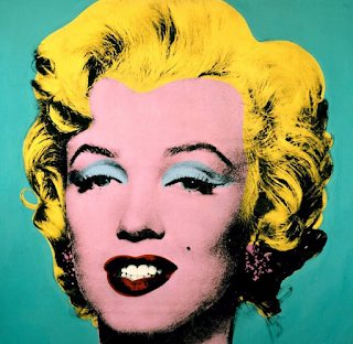
The first image/artist I decided to study was Andy Warhol, a famous pop artist. From his pieces I chose to replicate the Shots of Marilyn.  Rather than shoot multiple colors I focused on the painting with a teal background.    Original: Andy Warhol, Shot Marilyns, 1964 My Re-creation,  Shot Marilyns, 2016 My other artist I studied was impressionist, Claude Monet. Of his works I chose to re-create his piece,  La femme al ombrelle .  Original: Claude Monet, La femme al ombrelle , 1886 My re-creation,  La femme al ombrelle, 2016

Assignment #6: What can Photoshop do for me?:

Image
Here is the picture that is unedited that I grabbed off of Google. Here is my edited version through photoshop, with focus on the tennis ball.

Sketchbook #3: Folded Laundry:

Image

Assignment #5: Polar Opposites:

Image
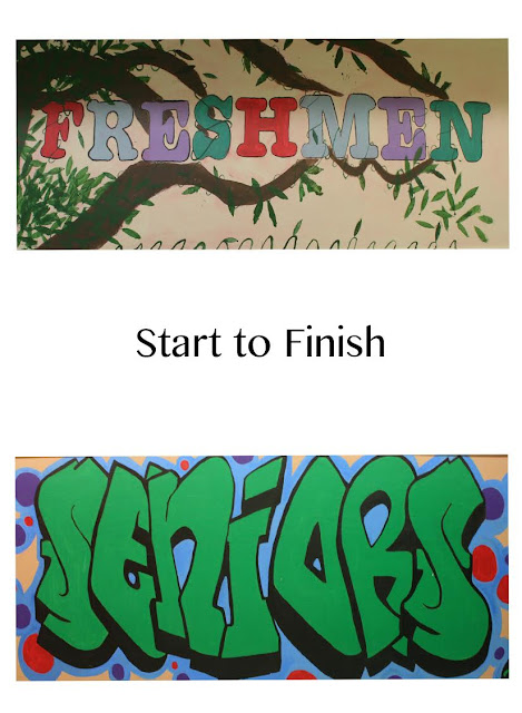
          My concept for the polar opposite assignment was originally going to be life vs. death, yet after I realized that I was not going to be able to shoot my concept, I landed on the idea of start and finish. While walking around the school, I stumbled upon the class murals painted on the walls in the basement. I found the Freshmen as well as the Senior murals and decided to photograph them. This, to me, is an example of a start and finish process that I am experiencing right now. I believe this is true for two reasons. Freshman year is the start of your high school career and the start of becoming a responsible young adult, or teenager. Whereas, senior year is the end to that period, and the start of your adult life. Freshmen year can also be seen as the start of growing up and the transition to adulthood, and the end of childhood. I say this due to the fact that you are faced with unknown challenges in a normally unknown environment with new people, rules, responsibilities, a

Assignment #4: Texture 101:

Image
Iso: 3200 f-stop: 4.5 SS: 1/160 Camera Mode: Manual Iso: 100 f-stop: 8 SS: 1/125 Camera mode: Manual Image from Google: I think this image shows good texture because the leaf's bumps and veins are zoomed in so closely. They have their own shadows and are in focus. Photographer: Unknown but I got it from the  digital-photo-secrets.com

Assignment #3: ISO, f-stop, Shutter Speed:

Image

Sketchbook #2: A Glass of Water:

Image

Assignment #2: Composition Project:

Image
Framing ISO: 220 f-stop: 4.8 Shutter Speed: 1/30 Camera Mode: Automatic* I think this photo uses the framing aspect of composition because the window, and archway frame the statue of Mary. The light is also framing the statue with the light coming into the building and surrounding her. I think that the image is eye-catching to the viewer because all the brightness and focus is at the end of the hallway.  Lines ISO: 1400 f-stop: 4.5 Shutter Speed: 1/30 Camera Mode: Automatic* Diagonals ISO: 100 f-stop: 6.3 Shutter Speed: 1/160 Camera Mode: Automatic* The diagonals and lines in the composition of the image draw the attention to where the bleachers meet. Allowing the viewer to look at the lined shadows of the bleachers. I think the composition is strong because the diagonals add depth to the image. Clear Subject of Interest ISO: 560 f-stop: 3.8 Shutter speed: 1/30 Camera Mode: Automatic* Texture ISO

Sketchbook #1: Old Shoes:

Image

Assignment #1: Selfie without myself:

Image